Journey Fertility
2025 – Present
A platform for every part of fertility, from egg freezing and IVF to hormone checks.
Multidisciplinary designer, artist and educator working across London, Barcelona and Istanbul. She co-founded Magna Ventures and is currently working at Journey Fertility.
A platform for every part of fertility, from egg freezing and IVF to hormone checks.
A voice journal that works through one call a day. It rings at dusk, asks a few gentle questions and keeps what you say as a page.

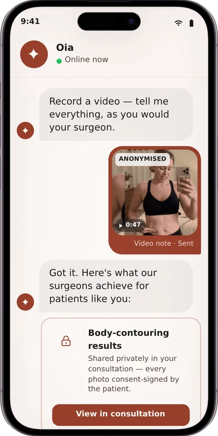
A luxury AI concierge for cosmetic-treatment journeys. The interface is the agent.
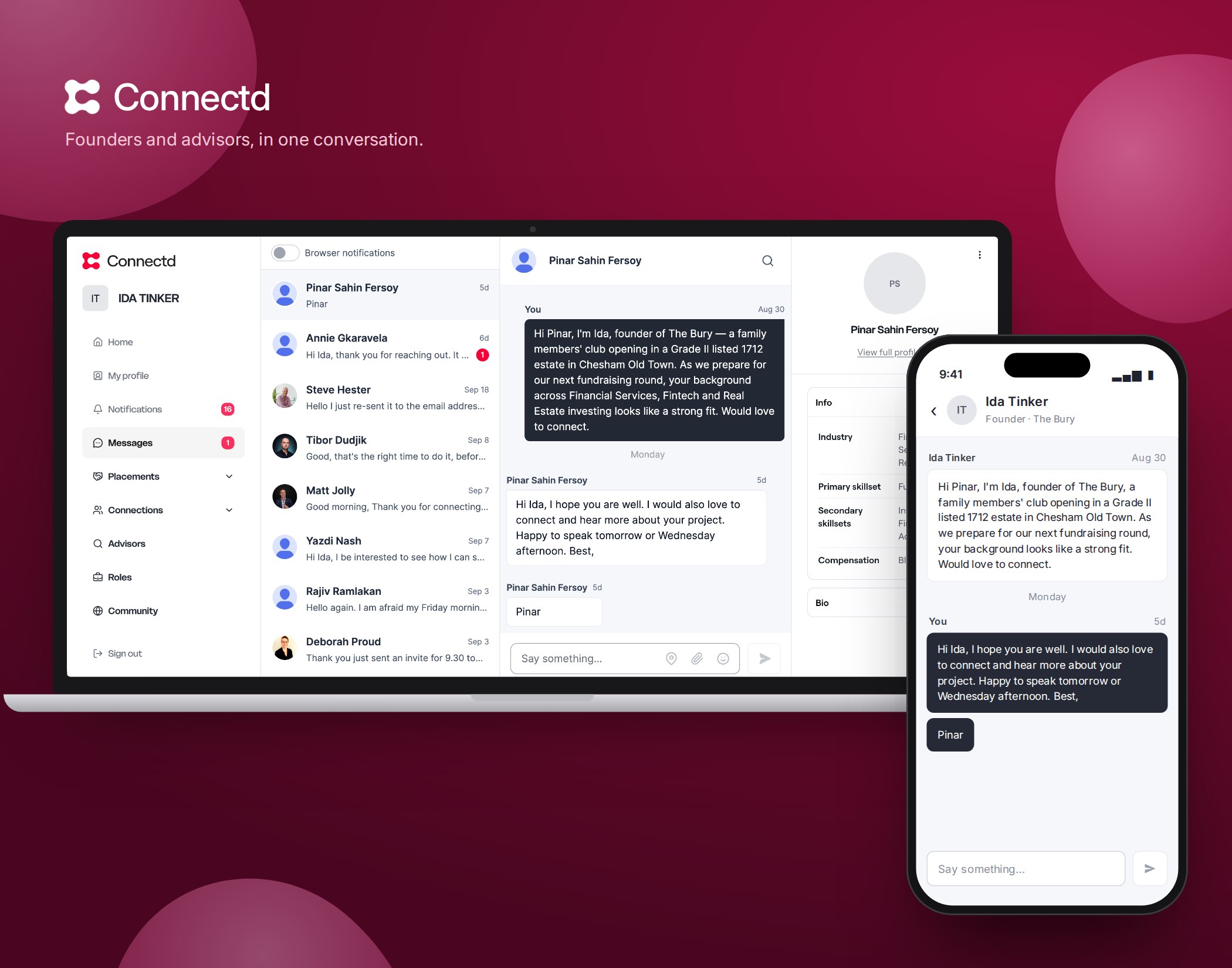
A marketplace matching startups with advisors. It began three-sided; my research led the leadership team to drop investors.
Accessible health and finance platforms used by millions, across three regulated industries.
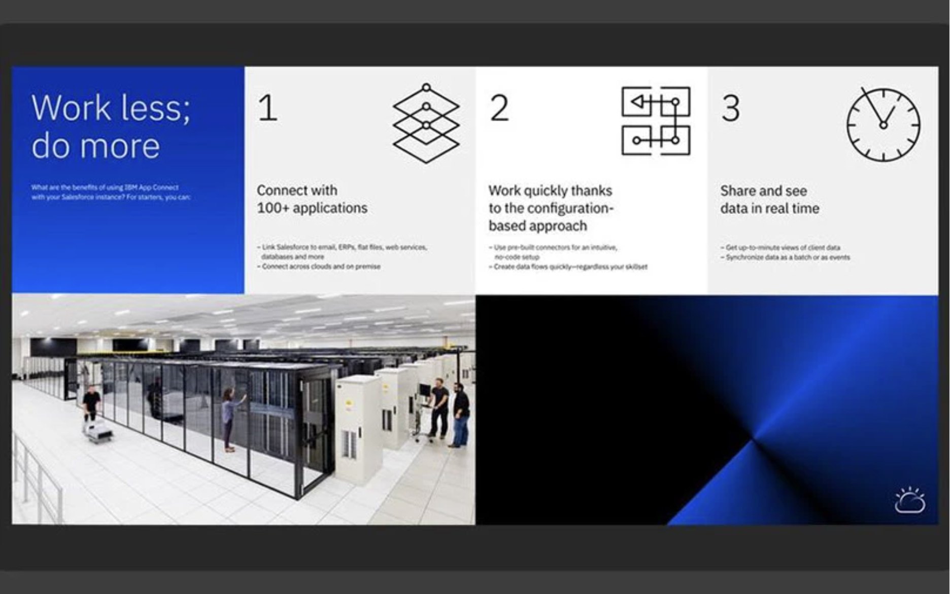

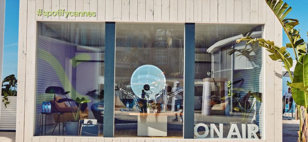
Installations, events and retail experiences for Facebook, Spotify, IBM and Mazda.
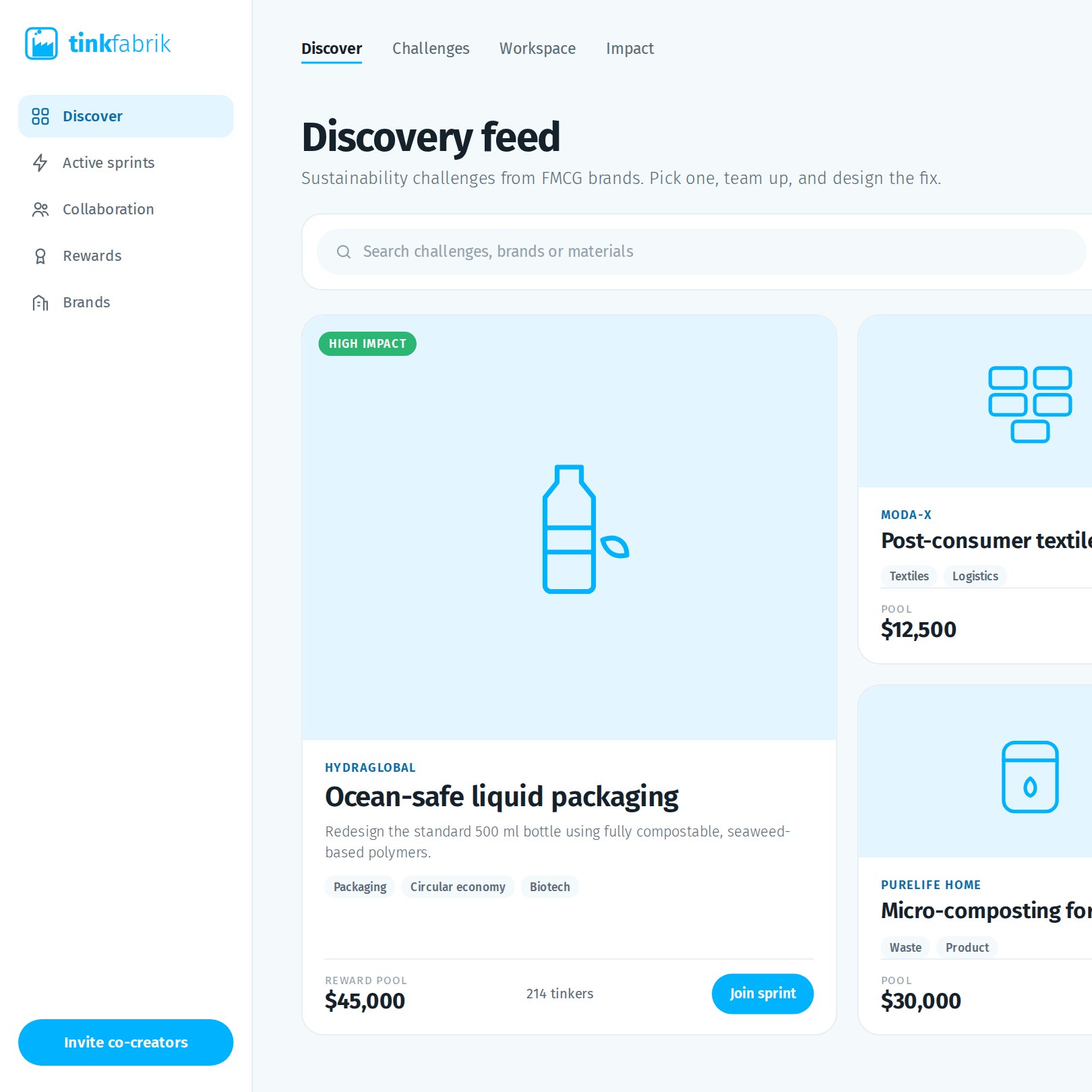
A co-creation platform where designers and FMCG companies solve sustainability challenges together. Runner-up, MIT Business Plan Competition.
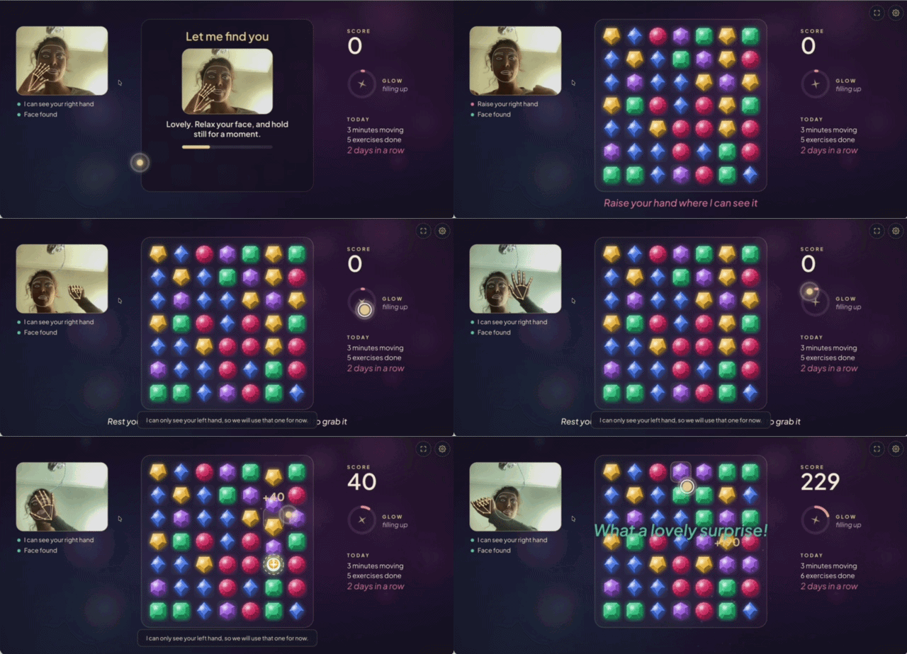
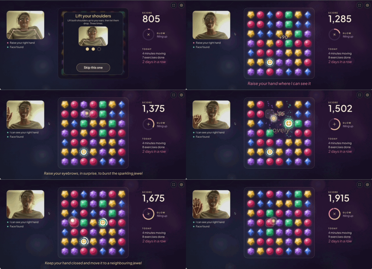
A game for Mum. I built this for my mum, who has Parkinson's. Hand and face tracking turn her daily exercises into play: open your hand over a gem, then close it to grab. mum.magnaven.com →
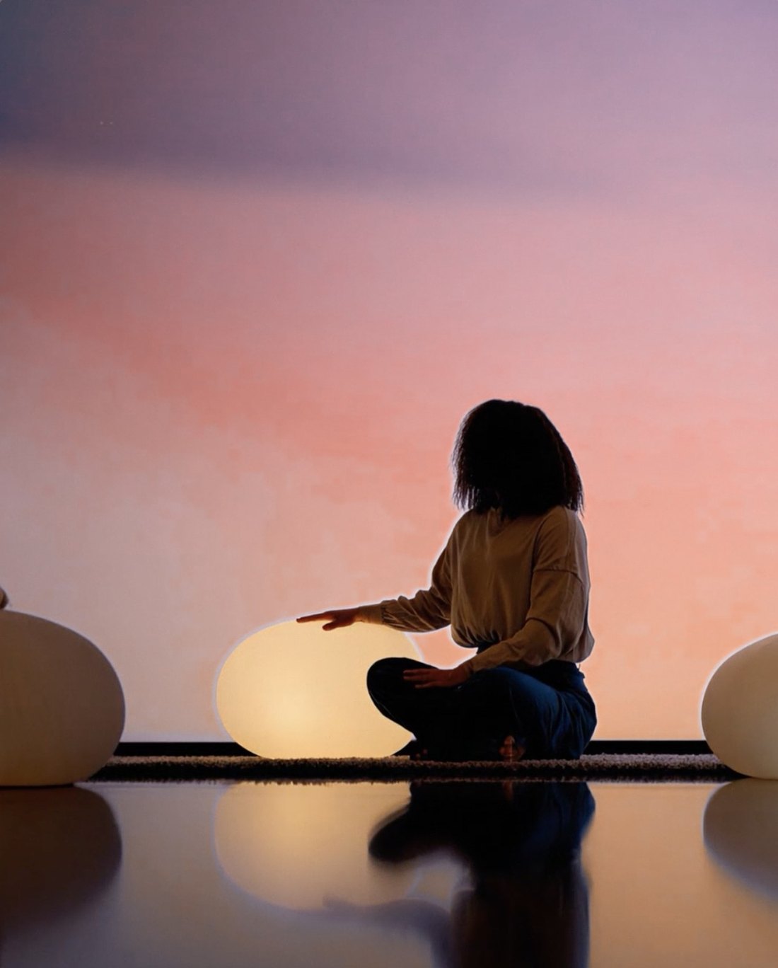
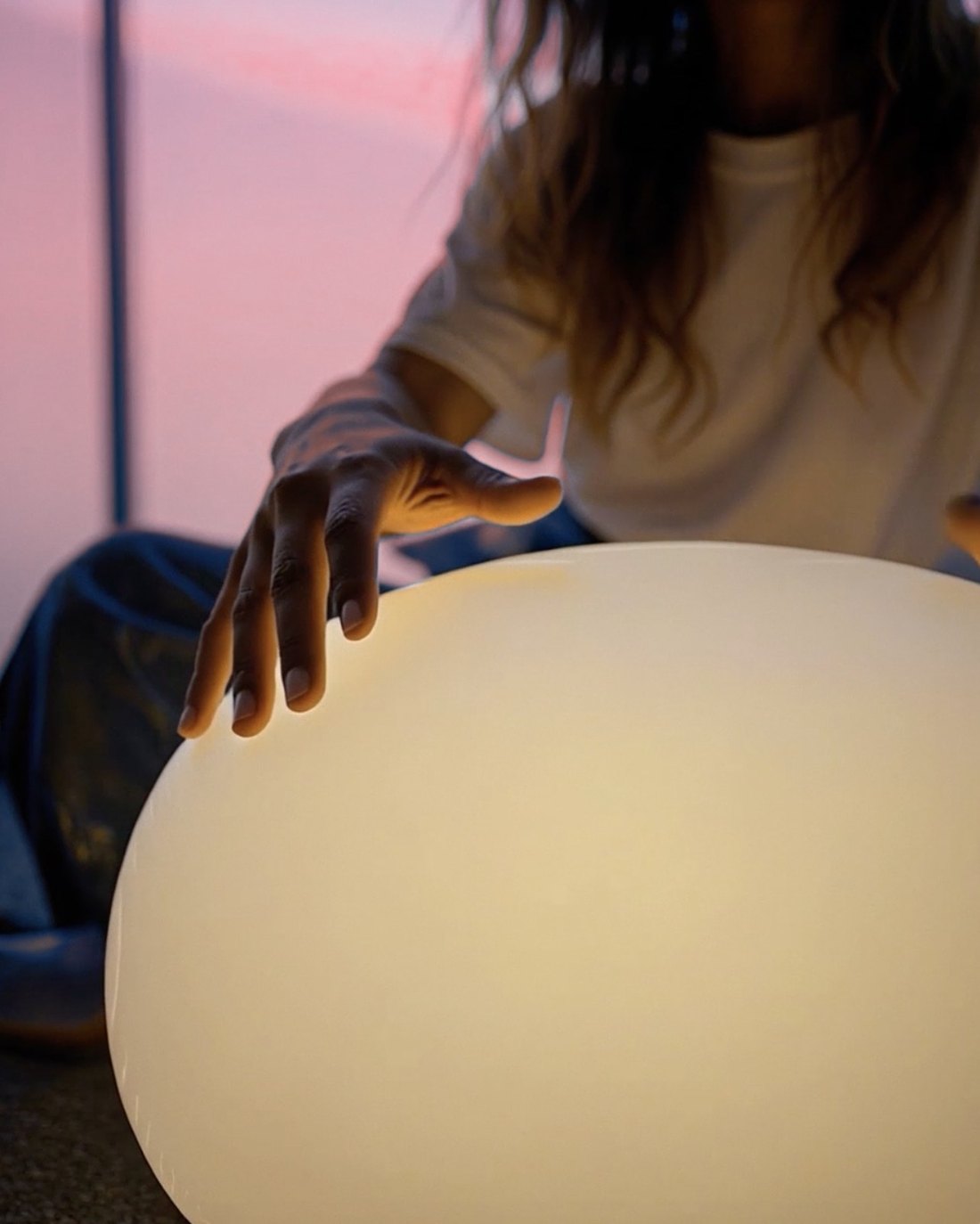
Pulse. An ongoing study of how rhythmic light, sound and animation shape perception. It began when I noticed that sitting next to a pulsing light felt like being in company. Each object and sculpture has proximity or touch sensors, and answers the person nearby with a pulse.

Prints. A series inspired by giving my fingerprints at border control in different countries. What would happen if every print had a sound?
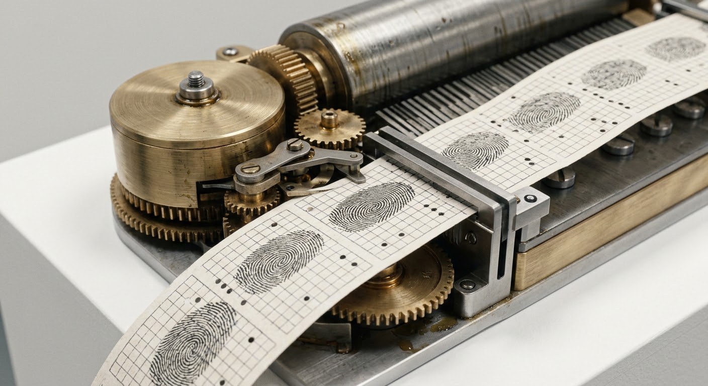
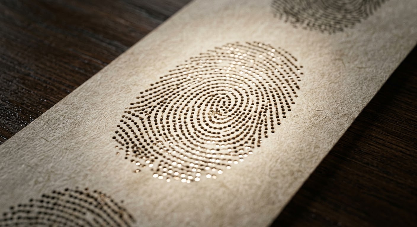
How would a fingerprint turn into notes, and then into music?
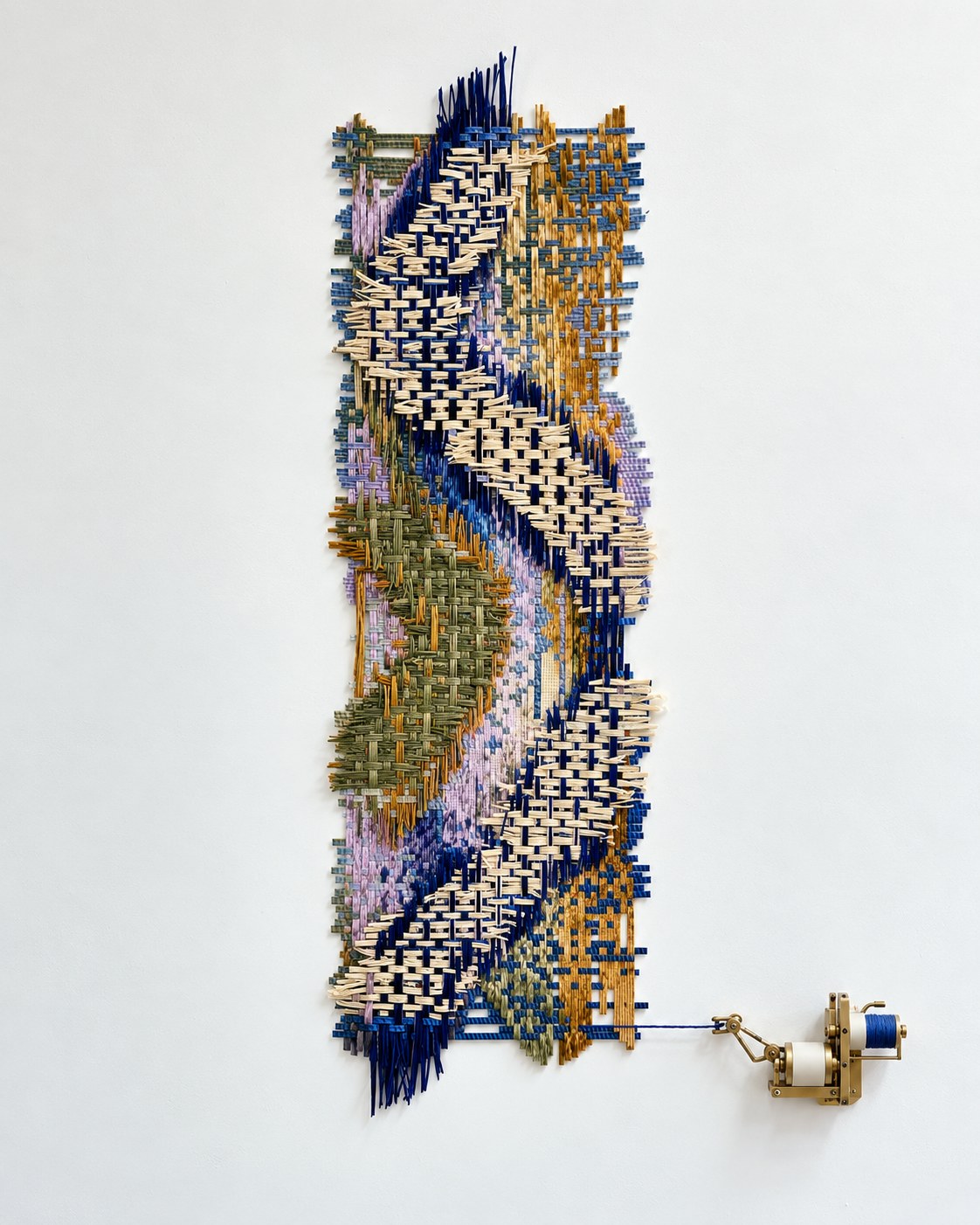
Time study no. 1. A second-year interaction design brief, answered in thread. Screens and round clocks make time feel endless. This woven calendar is unpicked one thread a day, so you watch the year run out.
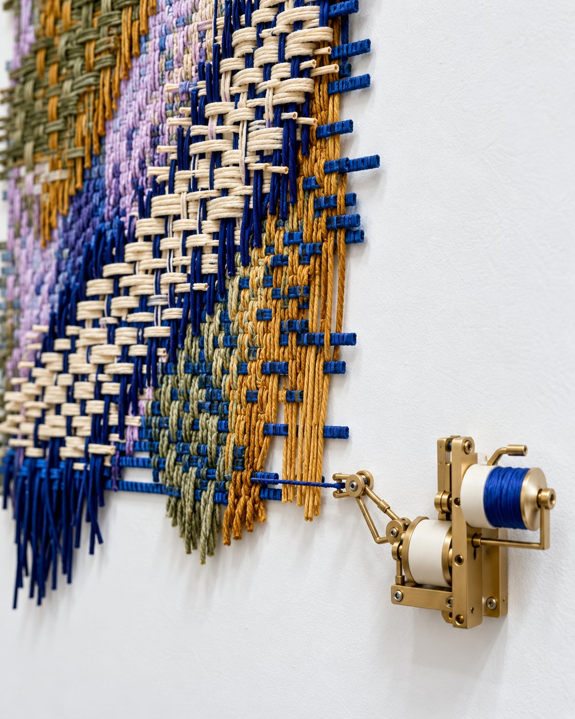
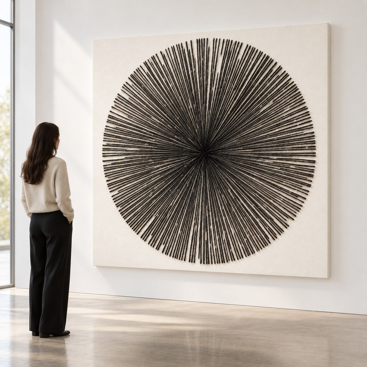
Time study no. 2. One year as a single long string, shaped into a dandelion on a kinetic canvas. The mechanism removes one string each day.
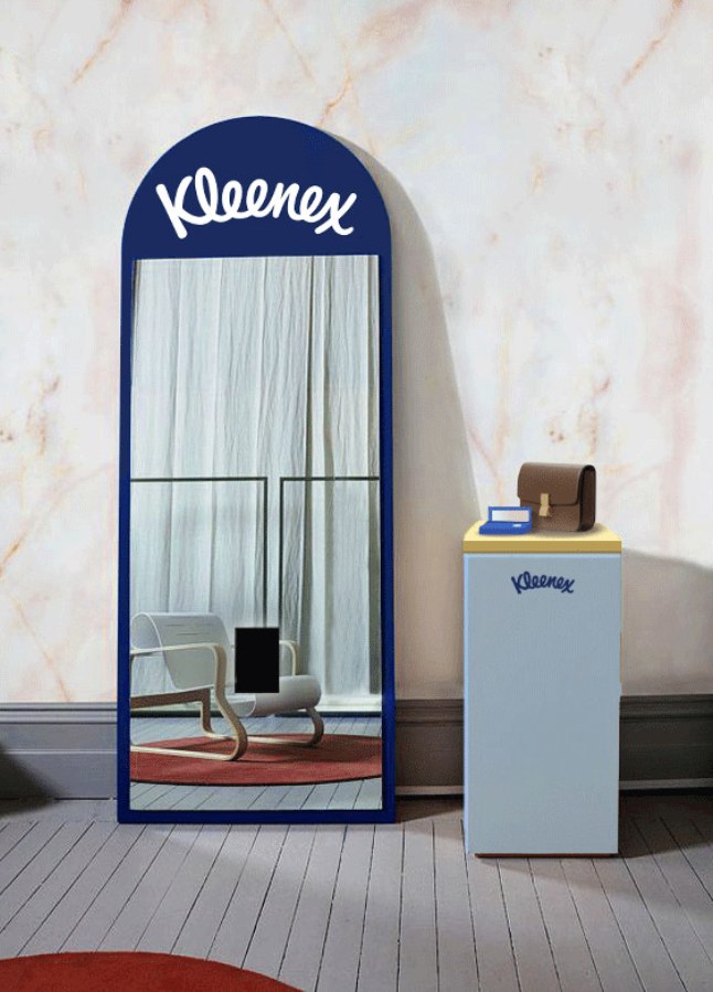
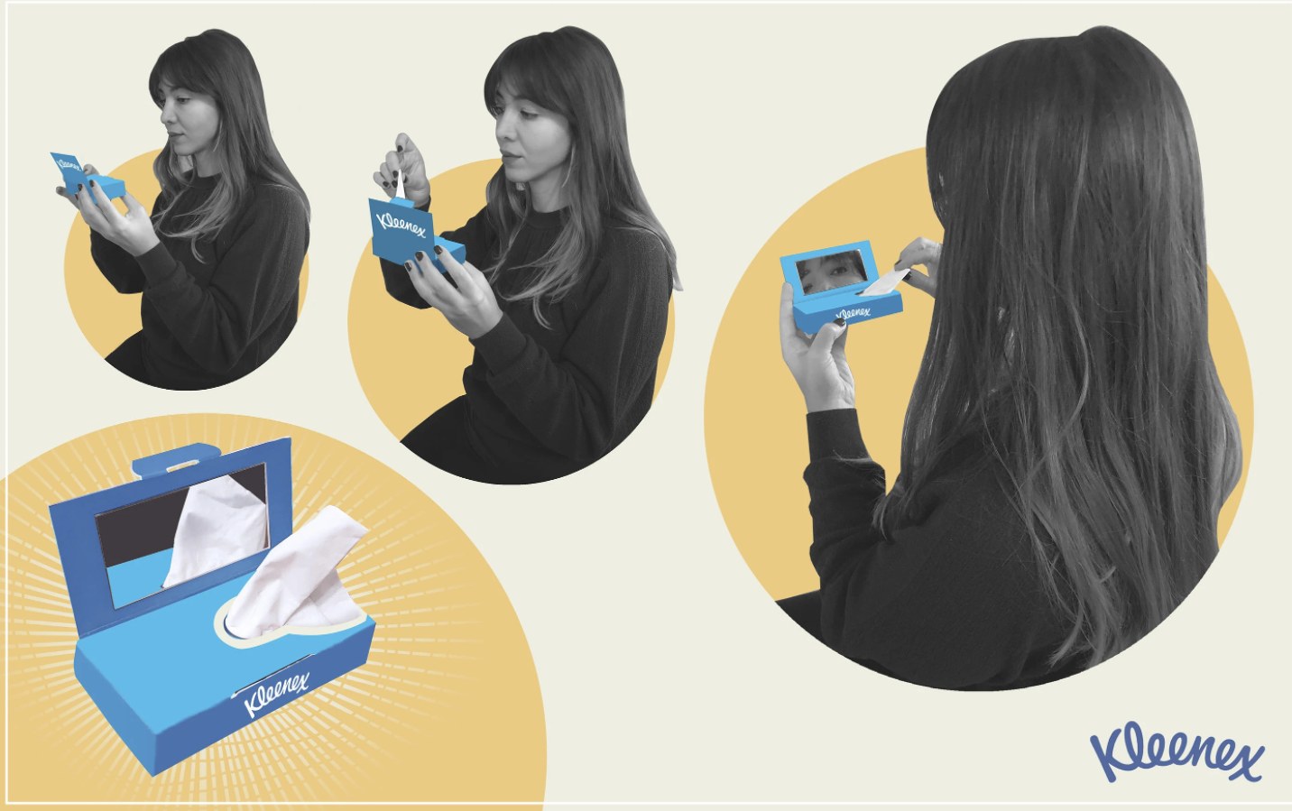
Kleenex compact. A pocket tissue box with a mirror in the lid, for a quick check on the go. Winner of the Innovative Packaging Award.
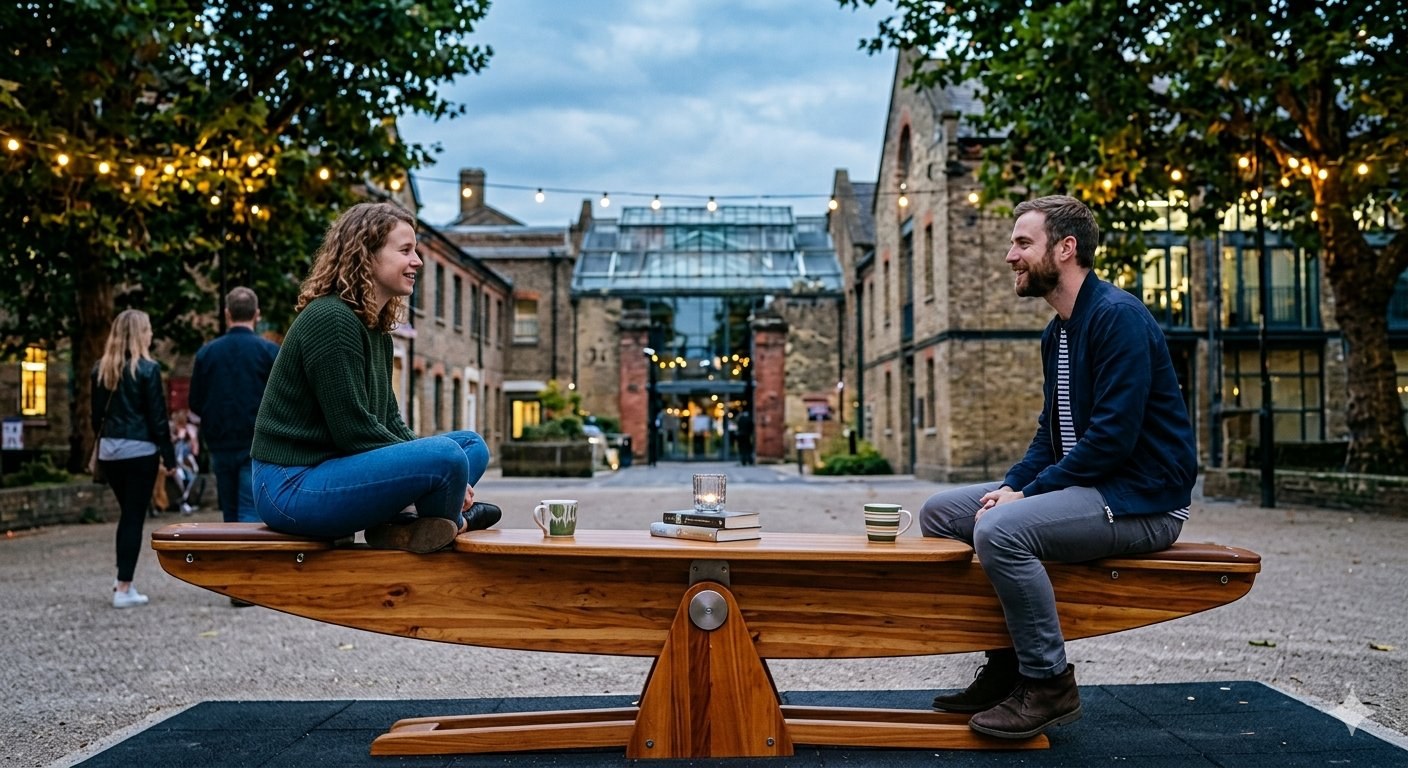
2 to sit. A study of human interaction, shown at the Istanbul Design Biennale 2018. The seat only works with two people facing each other, so you look up, pay attention and leave your phone alone.

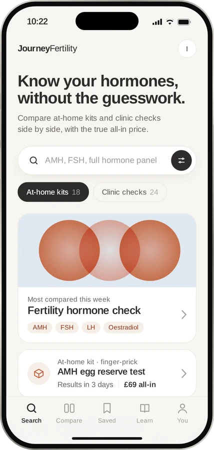
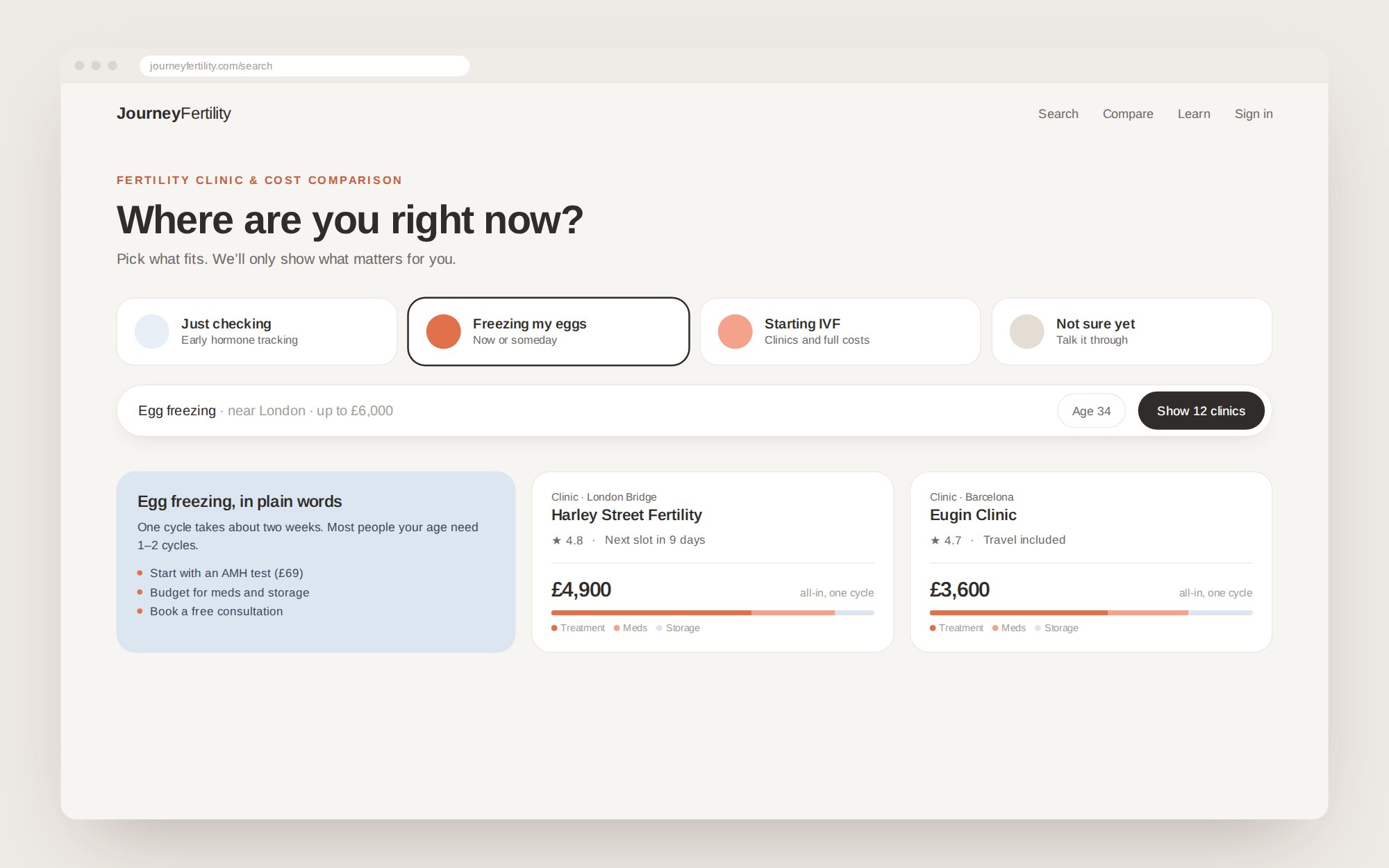
A platform for navigating every part of fertility, for women of all ages. Egg freezing, IVF and hormone checks come first: search clinics and tests, with the full cost shown up front.
One search replaces ten browser tabs, and every option can be compared side by side.
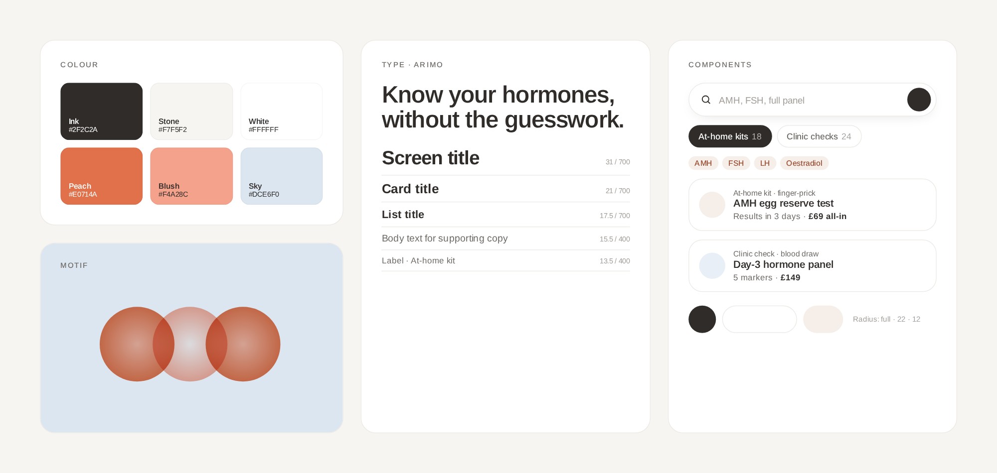
Brand design: the name, palette, type and voice.

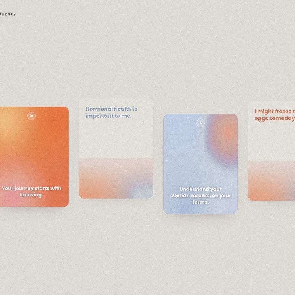
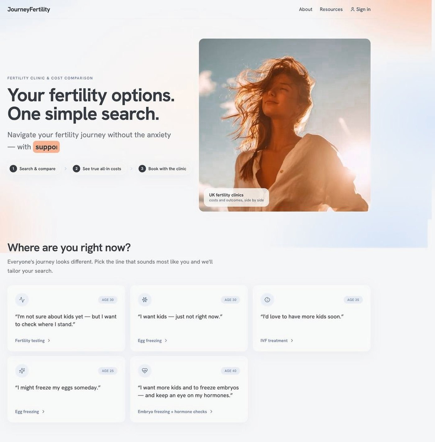
People arrive looking for very different things, from egg freezing and IVF to early hormone tracking, so sending each one to the right place was hard.
A search that caters to each group from the very first step, so everyone starts on the path that fits them.
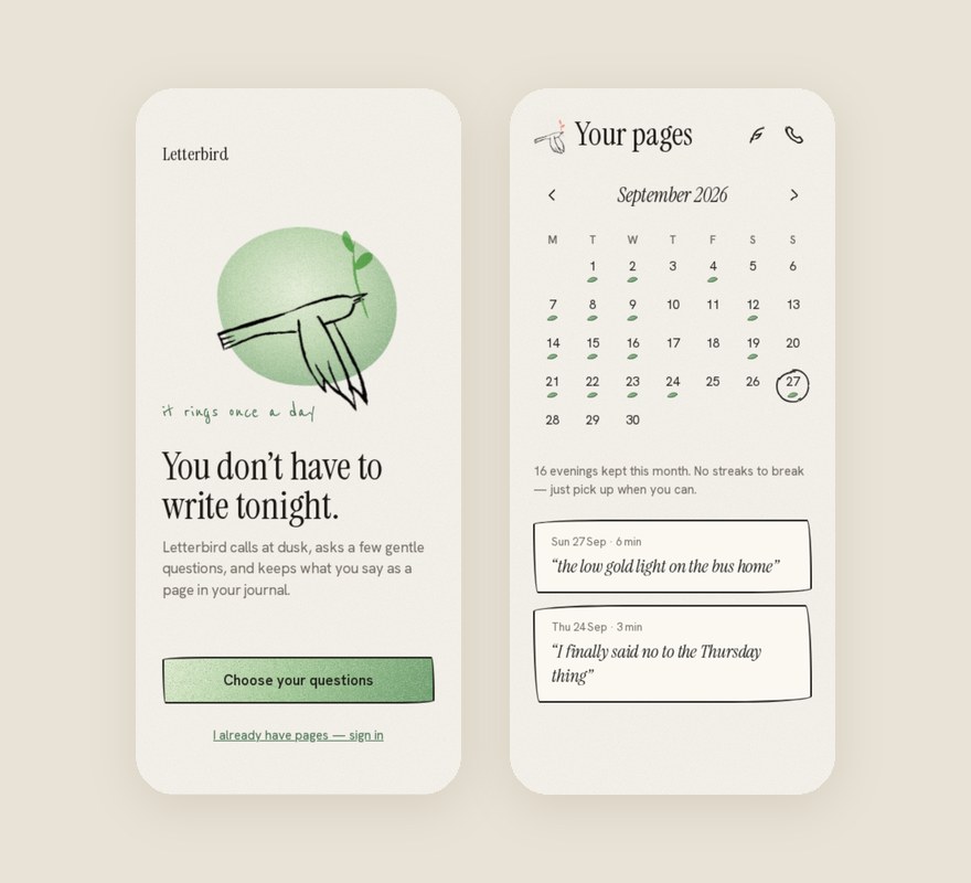

A voice journal with no typing. Letterbird calls once a day at a time you choose, asks up to three gentle questions, and keeps what you say as a page in your journal. I designed the UI and the motion kit for the Letterbird team.
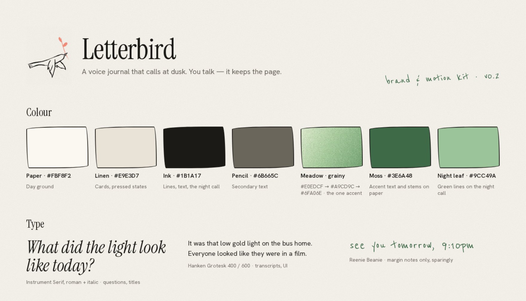
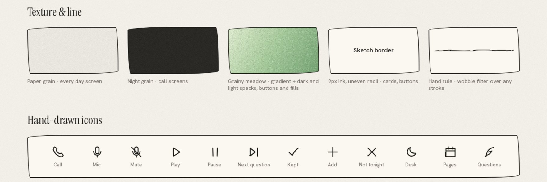
Paper and linen for the day, ink for the night call, and one grainy meadow green as the only accent. Hand-drawn lines and an uneven sketch border keep it feeling written, not built.
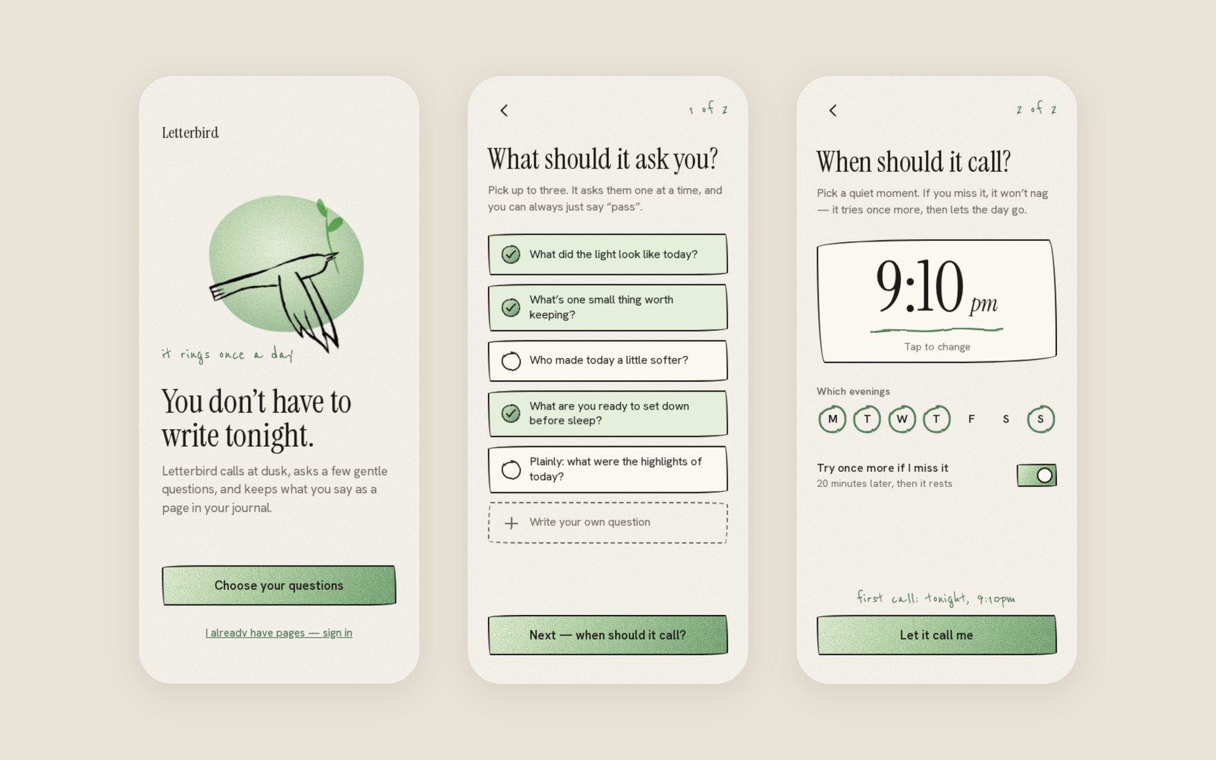

Setup is three screens: pick your questions, pick the evening, and let it call. If you miss it, it tries once more, then lets the day go.

Each state of the call has its own motion: sound arcs while it rings, bars that swell while you talk, a scribble while the page is written, and a sprig that grows when it is saved.
Journaling apps ask you to sit down and write, and most people stop within a week.
Take the writing away. One call a day asks the questions and turns your answers into a page, with no streaks to break, just a calendar that fills as you pick up. Inspired by Granola, the voice chat is turned into text in its own style: your words as a written page, not a transcript.
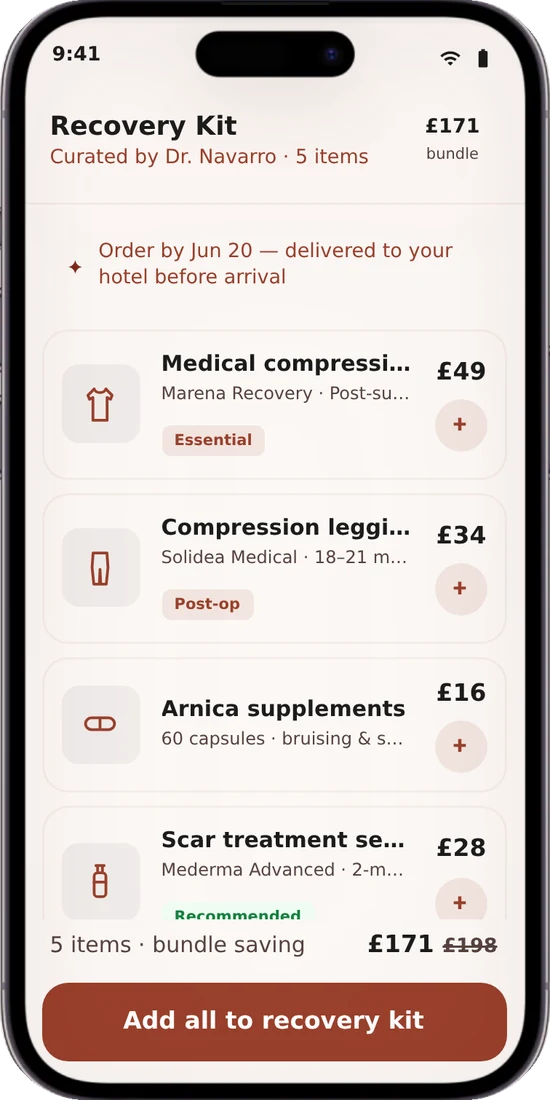
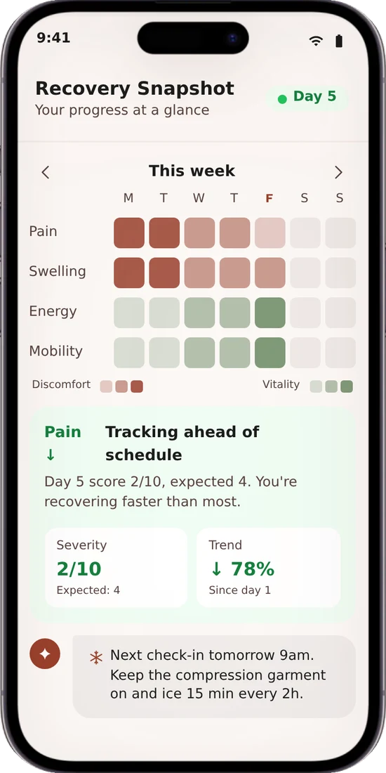
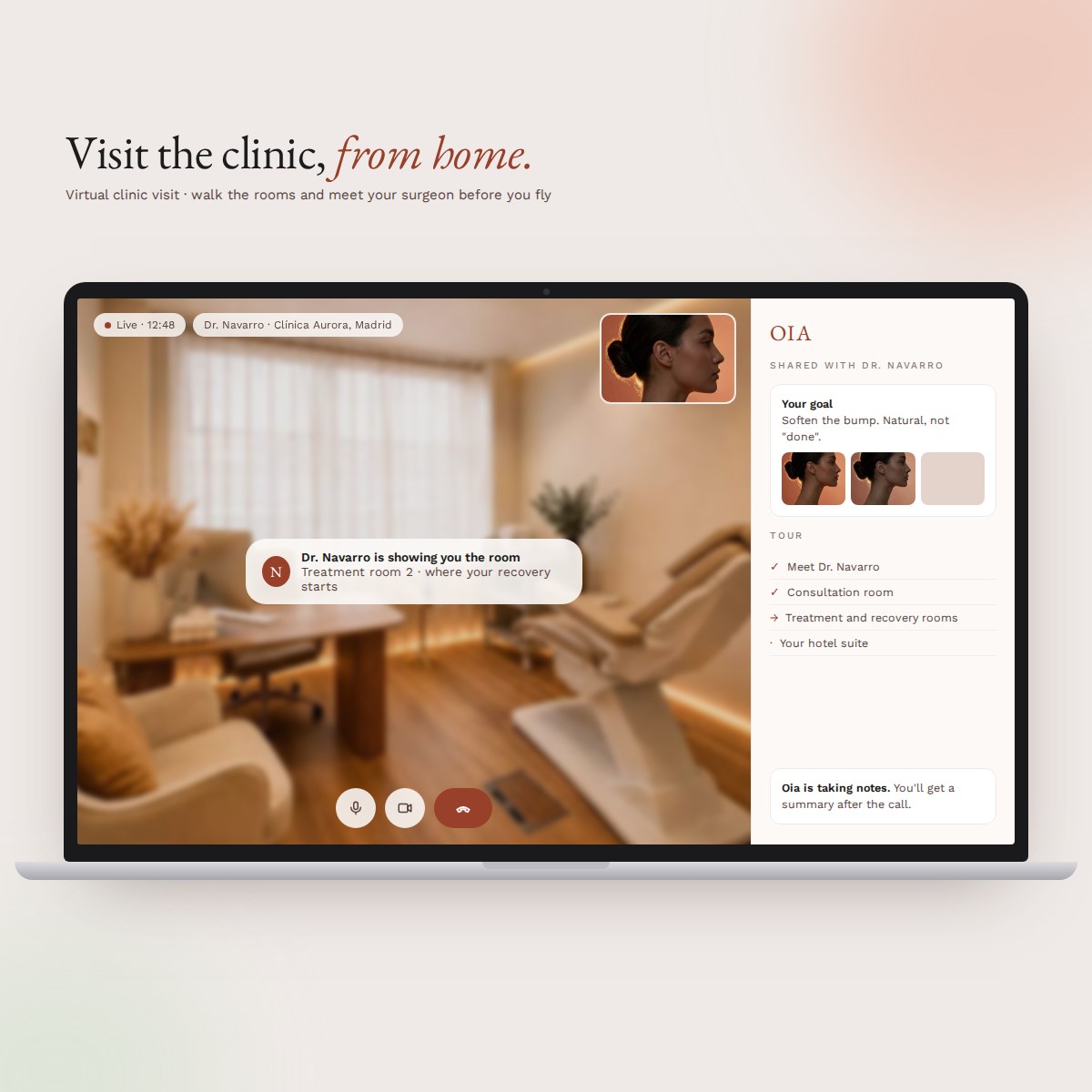
A luxury AI concierge for cosmetic surgery. No forms: patients talk to Oia, and she handles the rest.
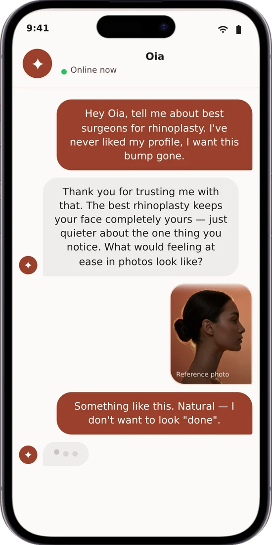
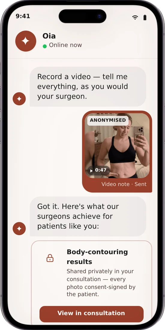
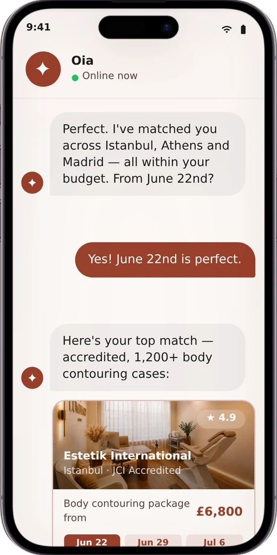
The interface is the conversation. Her voice, knowledge and limits were designed as carefully as any screen.

We also built an image-processing engine. It reads what the patient hopes for, compares their photo uploads with it, and shows suitable results and example after-surgery photos.

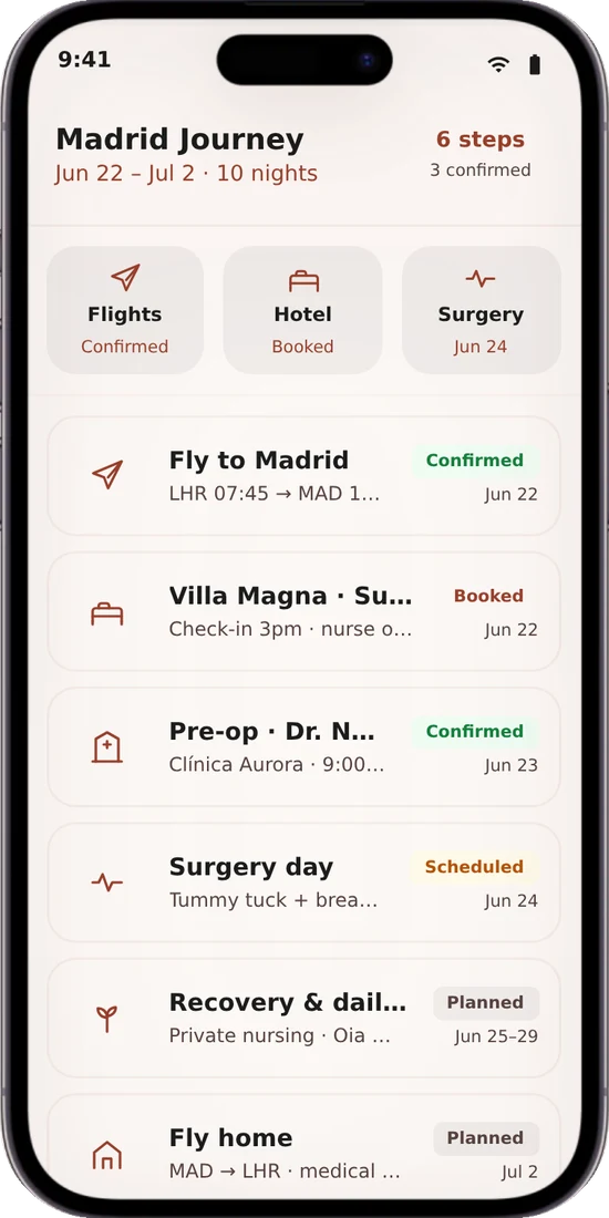
Patients need to feel emotionally supported and genuinely safe, and that safety has to be real, not just reassuring words in a chat.
We studied patient journeys that had gone wrong and designed every step to prevent those failures, so safety is built into the service itself.
A marketplace matching startups with the advisors and fractional leaders they need to grow. It launched three-sided, with investors too. My research showed why to drop them, and the leadership team agreed: it is now two-sided.
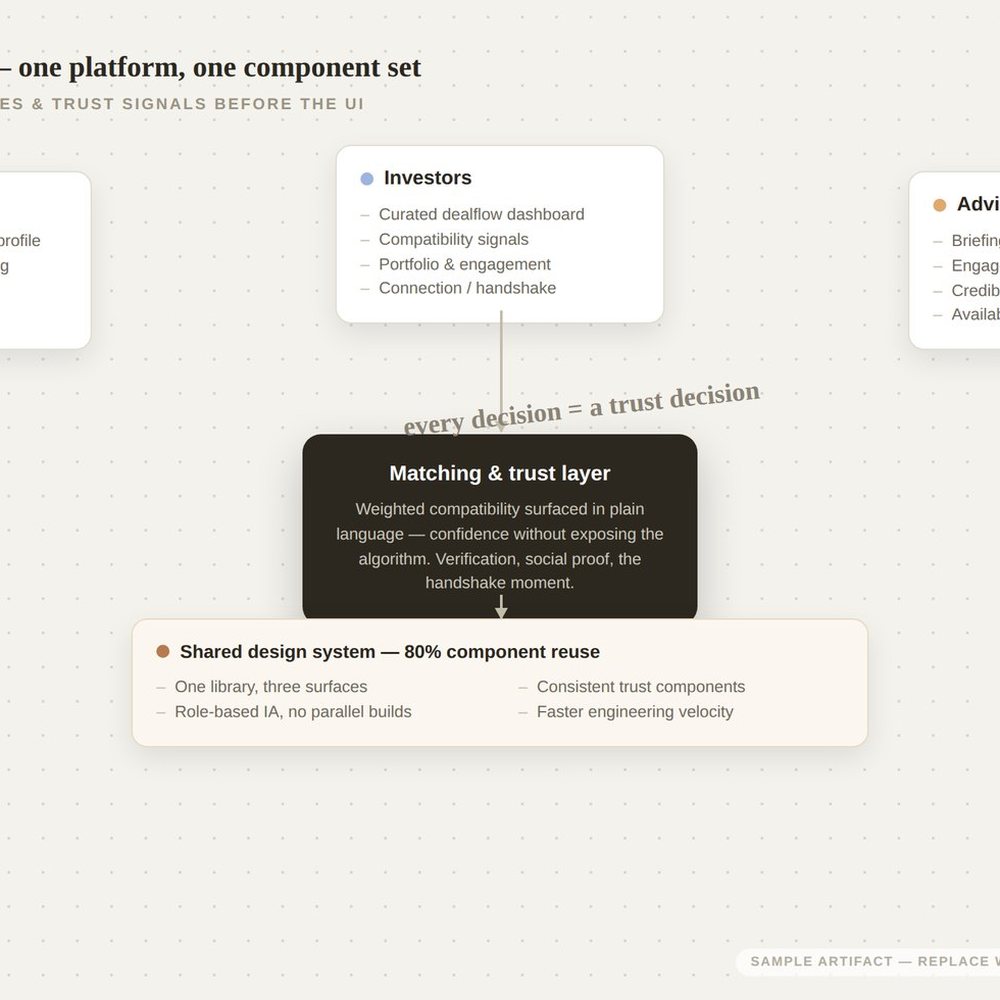
Fewer sides, better matches: removing investors let the product focus on startups and advisors, and on trust between them.
Three user types with different goals made the matching feel noisy. Onboarding and retention numbers were weak, and founders churned soon after signing up.
Research showed investors diluted the experience, so we cut to two sides and rebuilt onboarding around startup–advisor fit: an educational onboarding inspired by Airbnb, with ongoing in-product support.
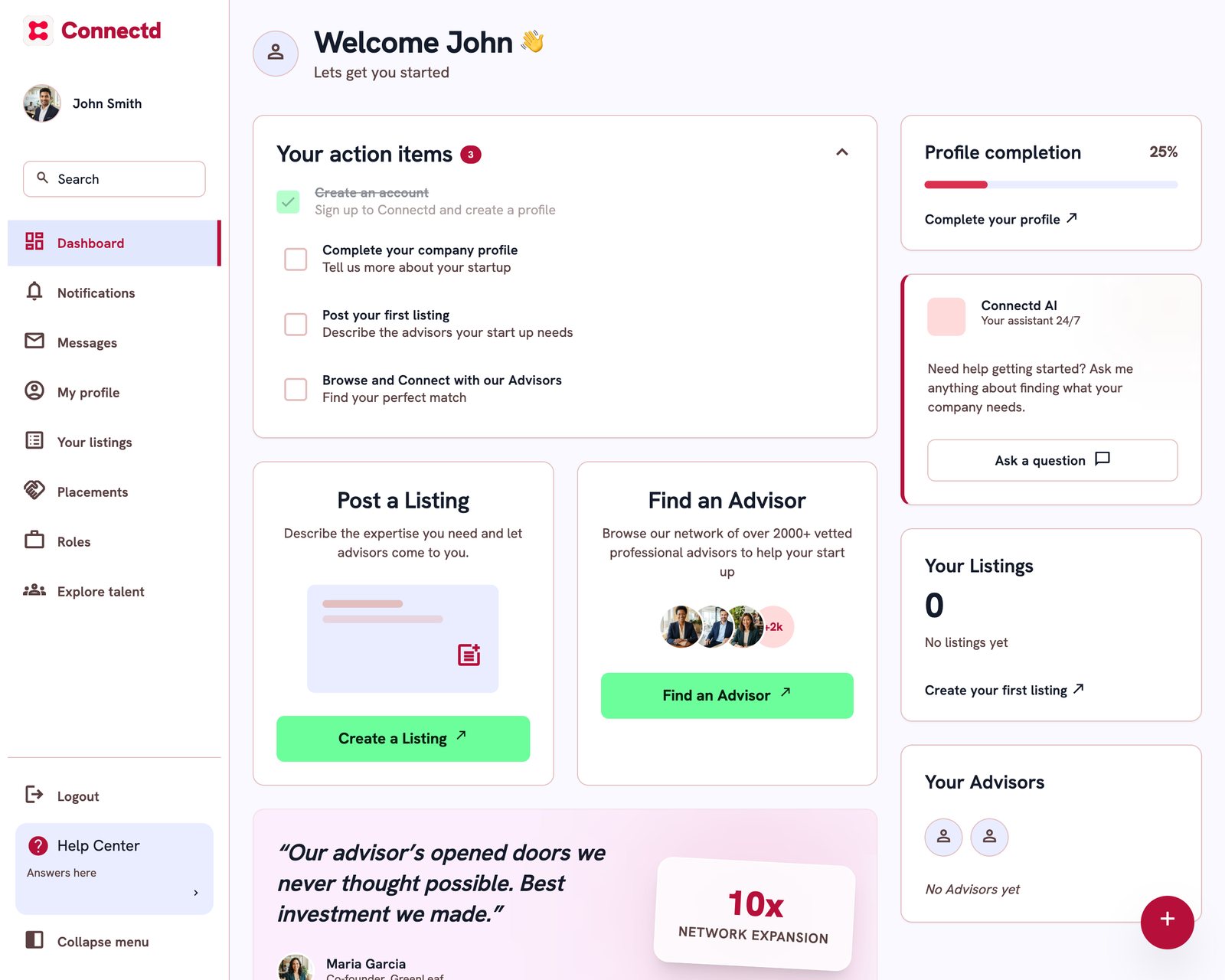
Health and finance platforms used by millions, made clearer and more accessible across three regulated brands.
I improved Vitality’s design component library and made accessibility improvements across its adviser pages.
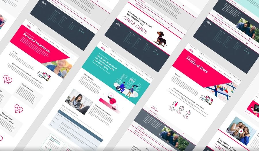
One shared component library, built to WCAG 2.1 AA, carried across every brand.
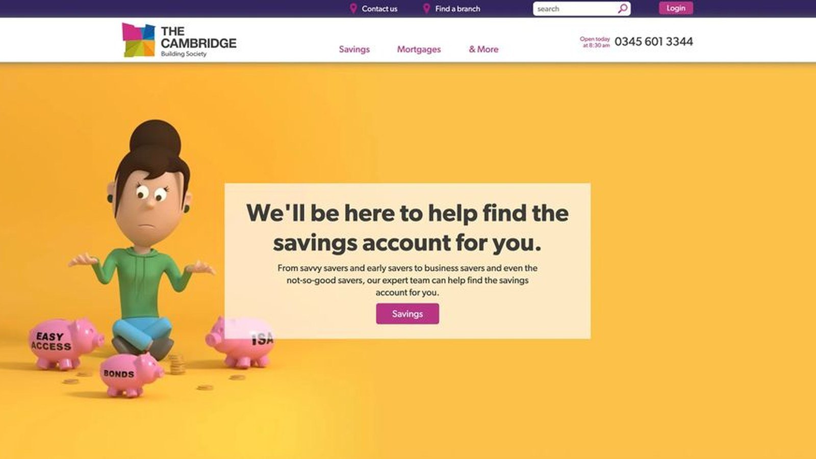
Brand and design system for Pension Buddy, from page templates to article pages.
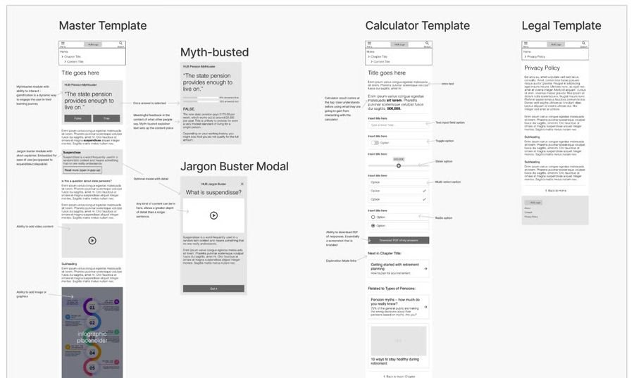
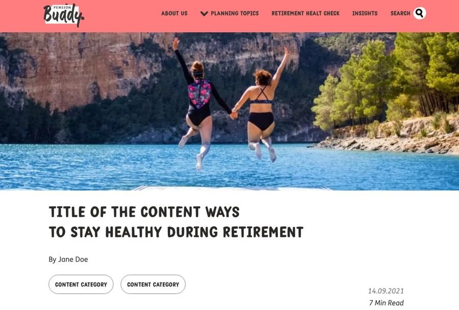
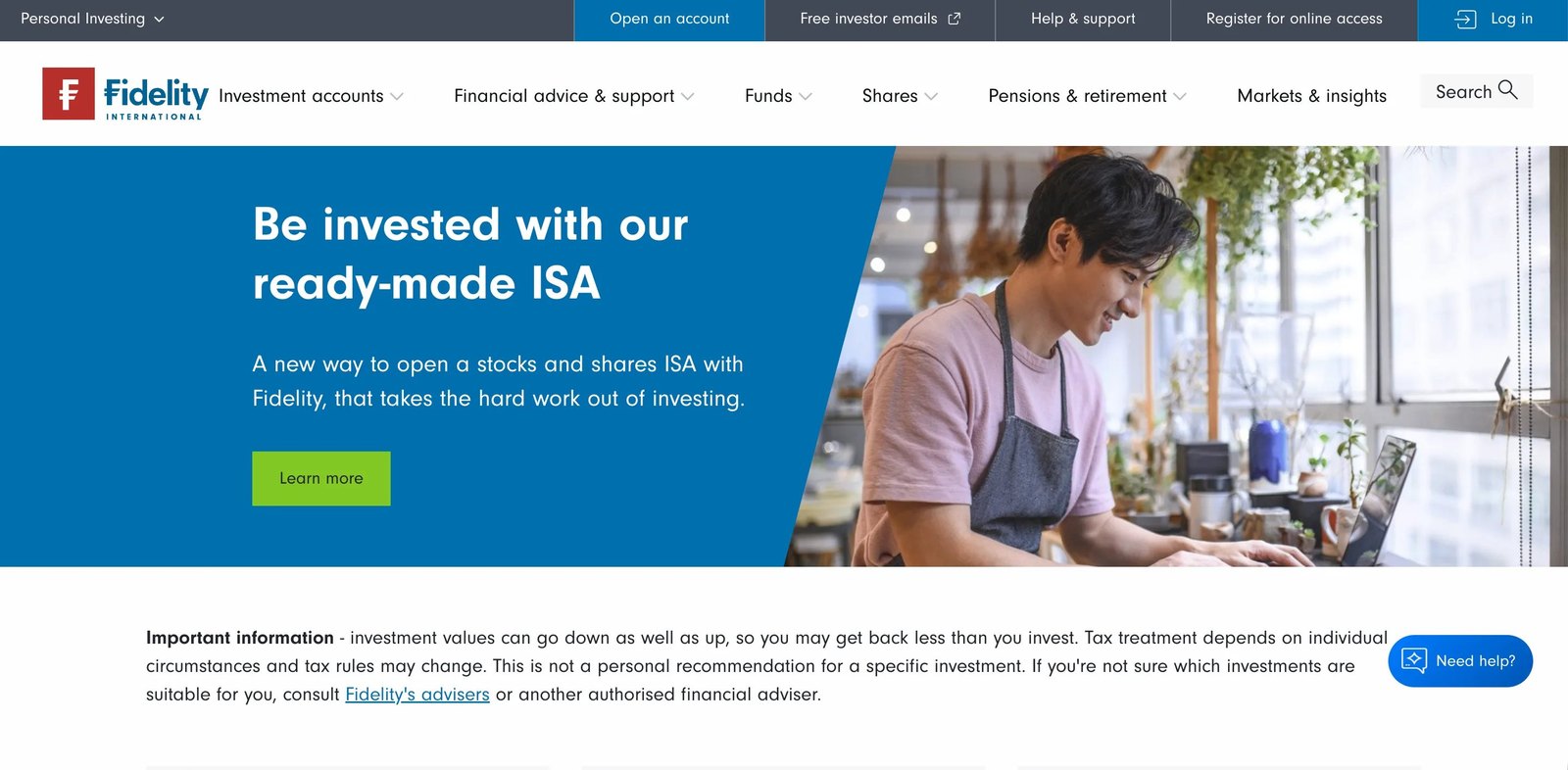
Three regulated brands, each with inconsistent components and pages that failed accessibility checks.
A shared component library built to WCAG 2.1 AA, rolled out across Vitality, Pension Buddy and The Cambridge.
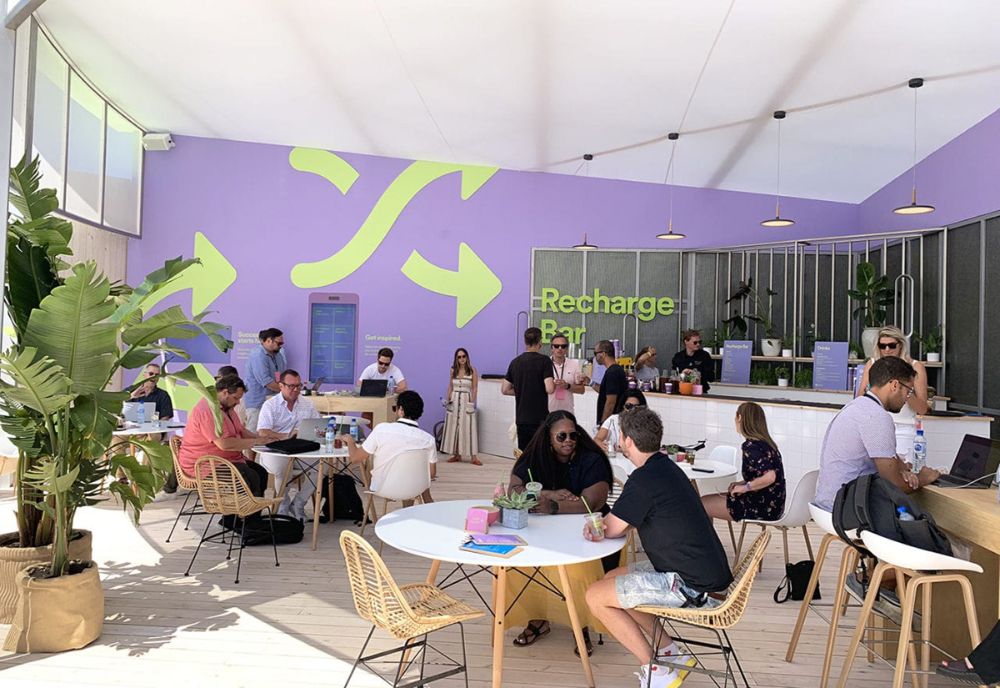
Physical and interactive experiences for global brands: installations, events and retail spaces, with stories visitors can experience.
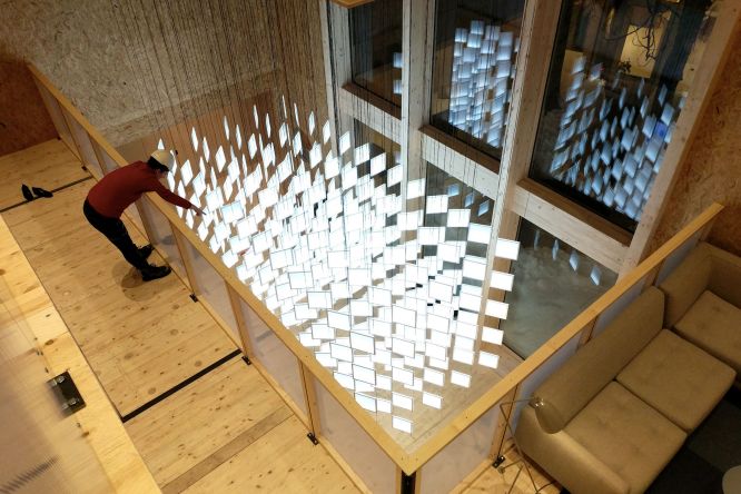
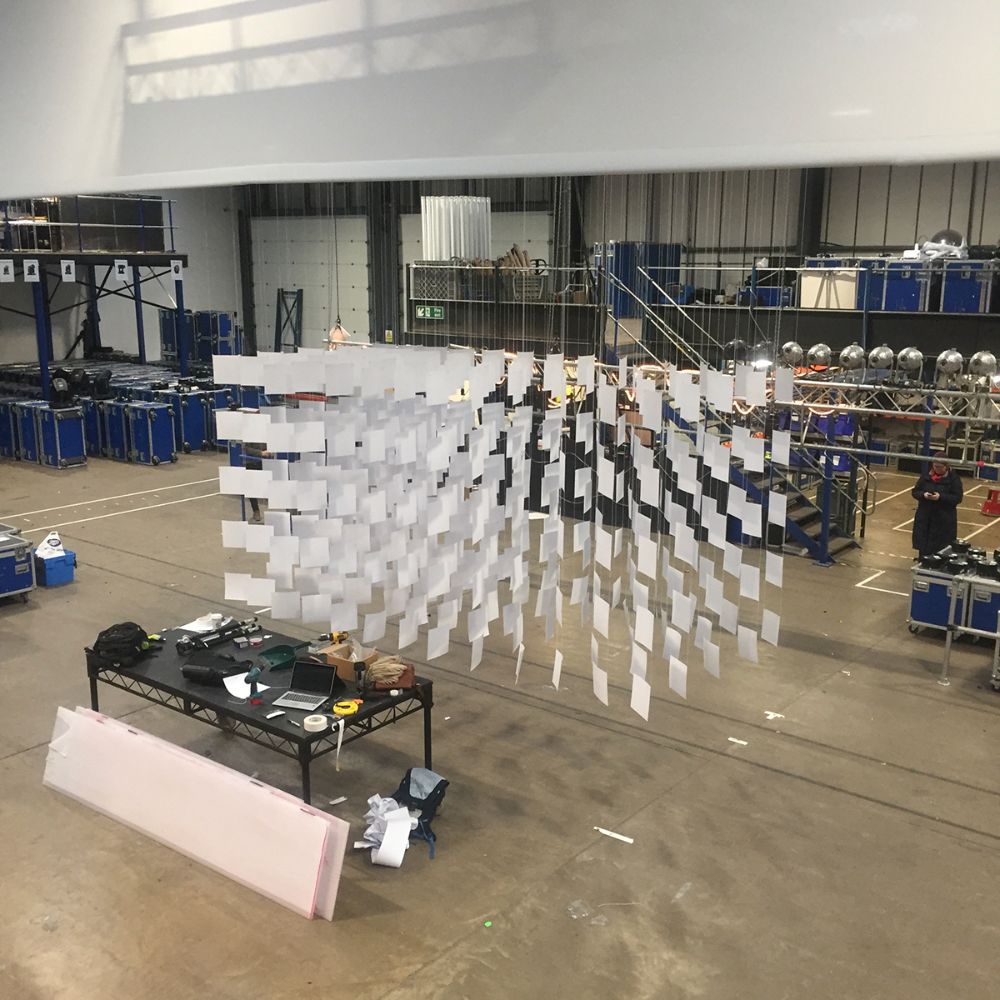
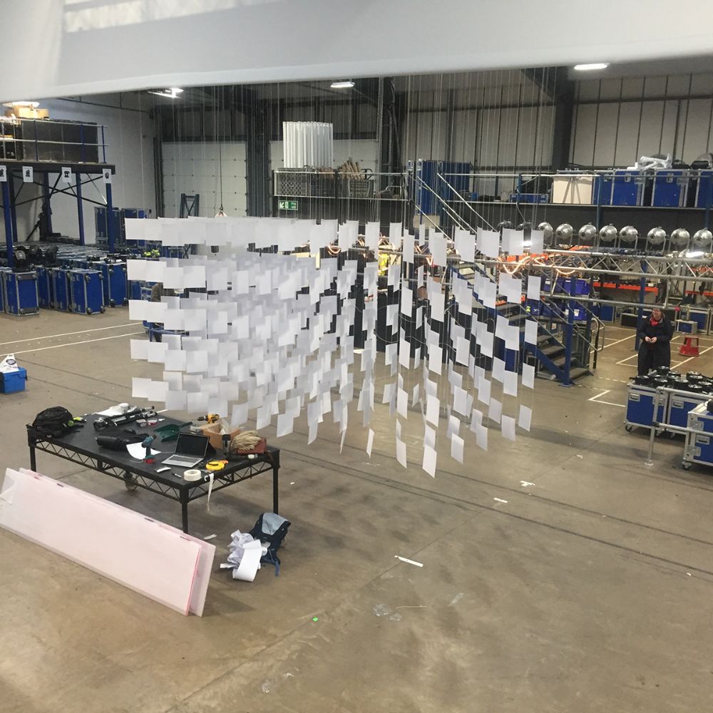
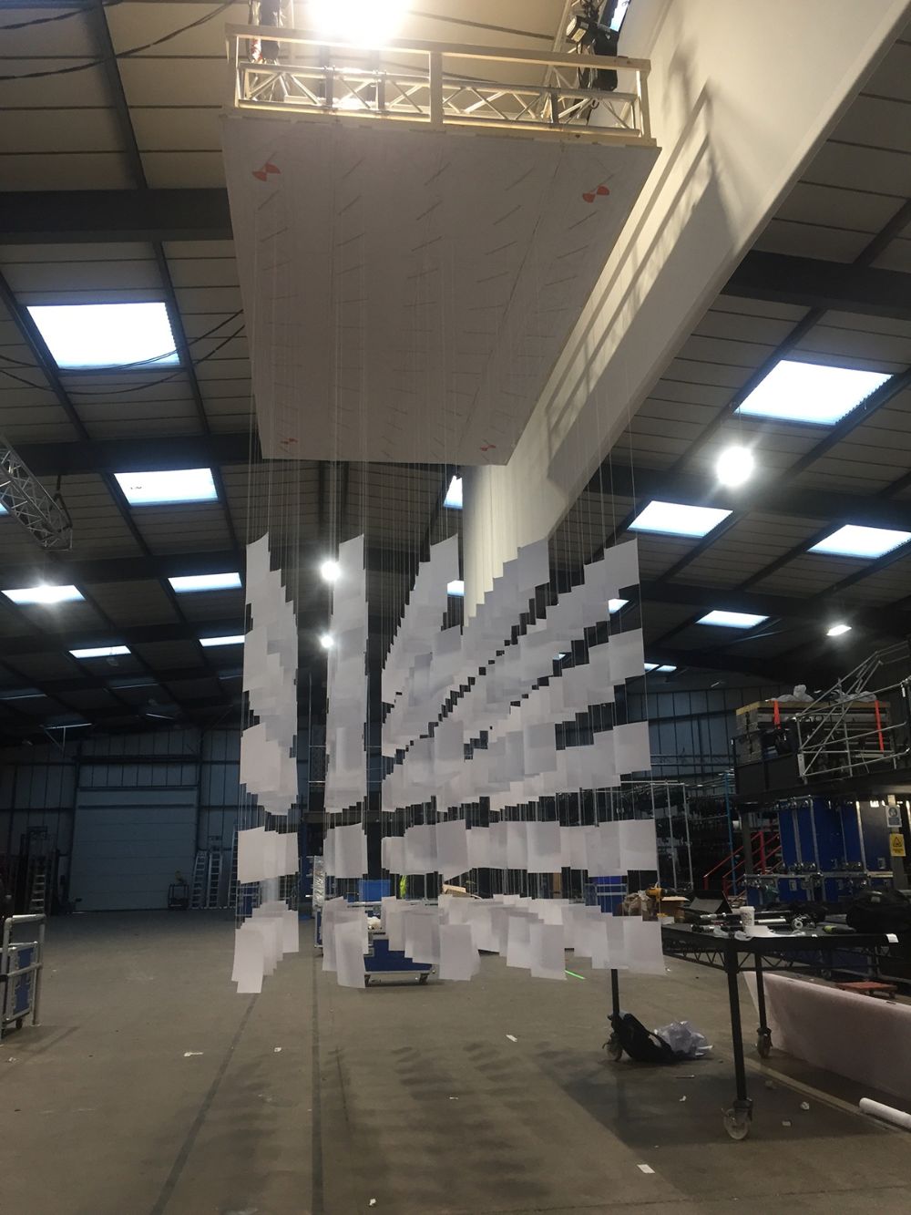
A glass-paneled light installation for the atrium. Visitors played light animations across the frosted acrylic panels from a touchscreen kiosk below, each one telling a data story from Facebook.
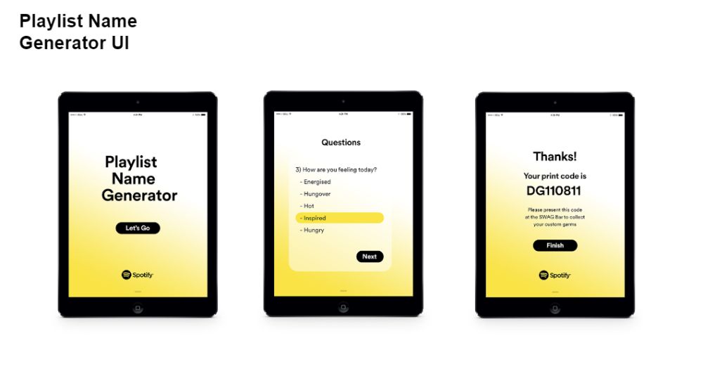
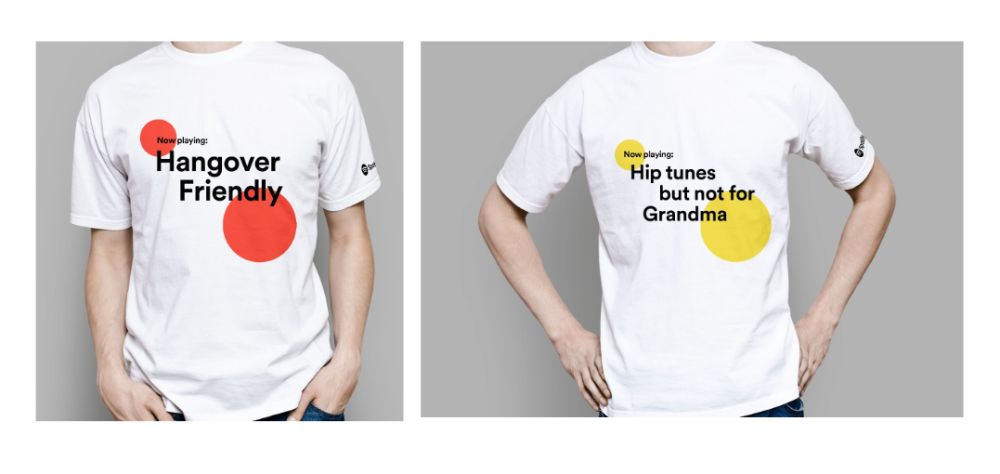
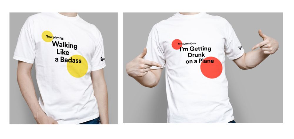
An AI playlist-name generator, inspired by Janelle Shane’s neural-network band names. Visitors answered a few questions and left with their playlist name printed on a T-shirt.
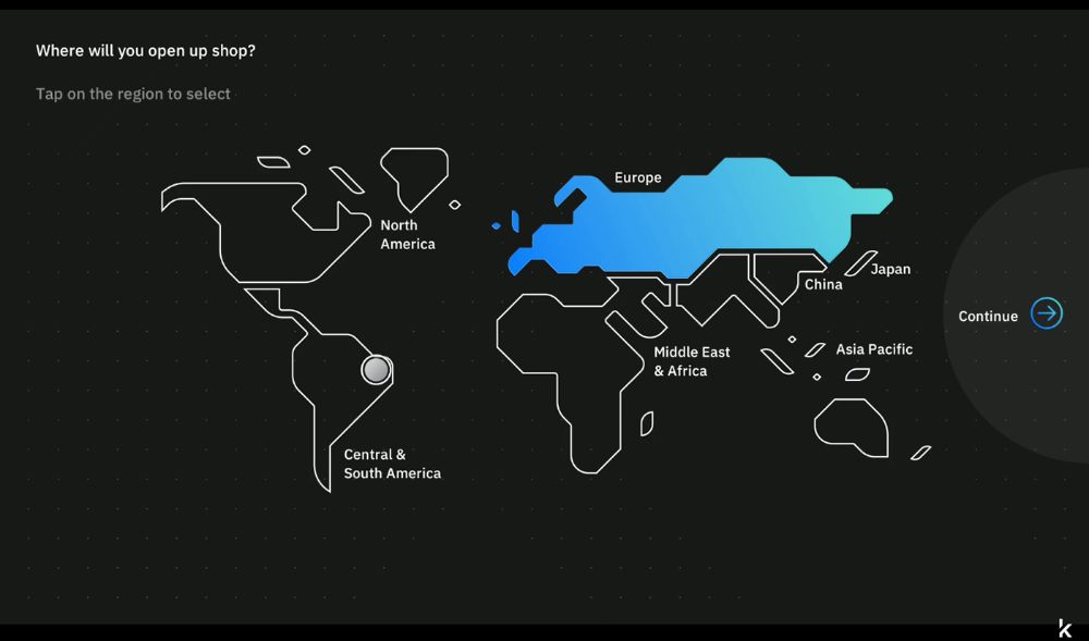
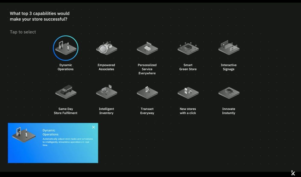
Visitors placed RFID-tagged ceramic objects on a reader, built their dream store on a touchscreen, and watched it come together on the display beside them.
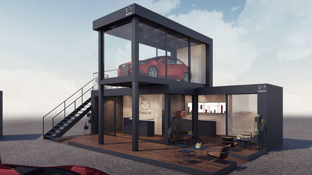
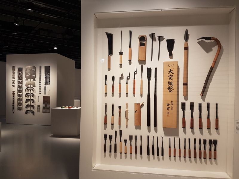
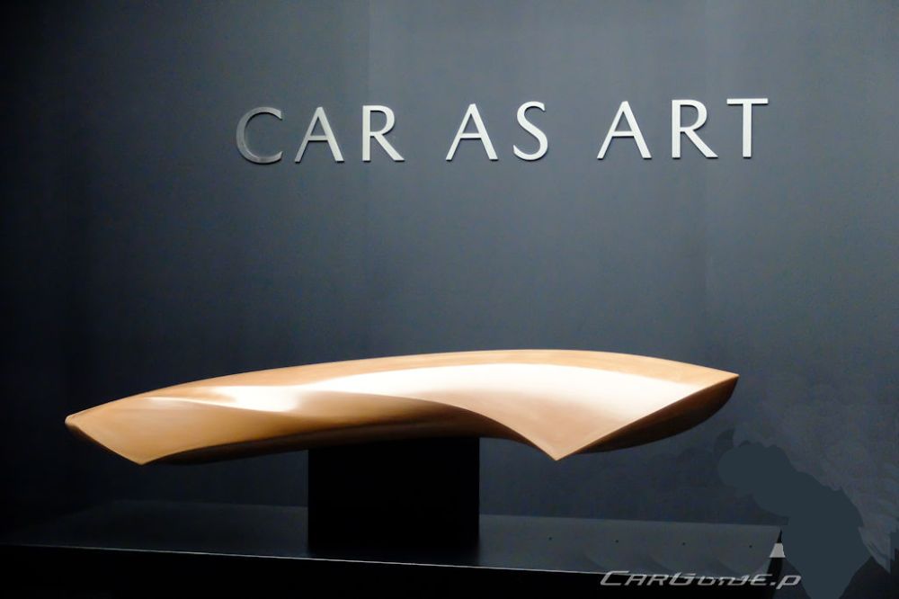
A touring pavilion that took visitors into Mazda’s world of craftsmanship and the human touch behind every car.
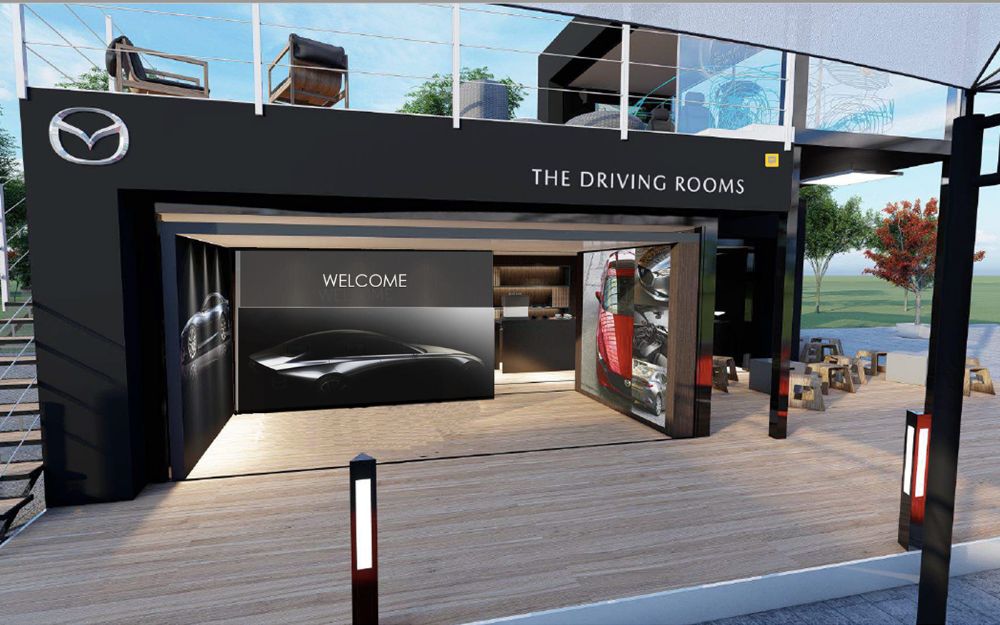
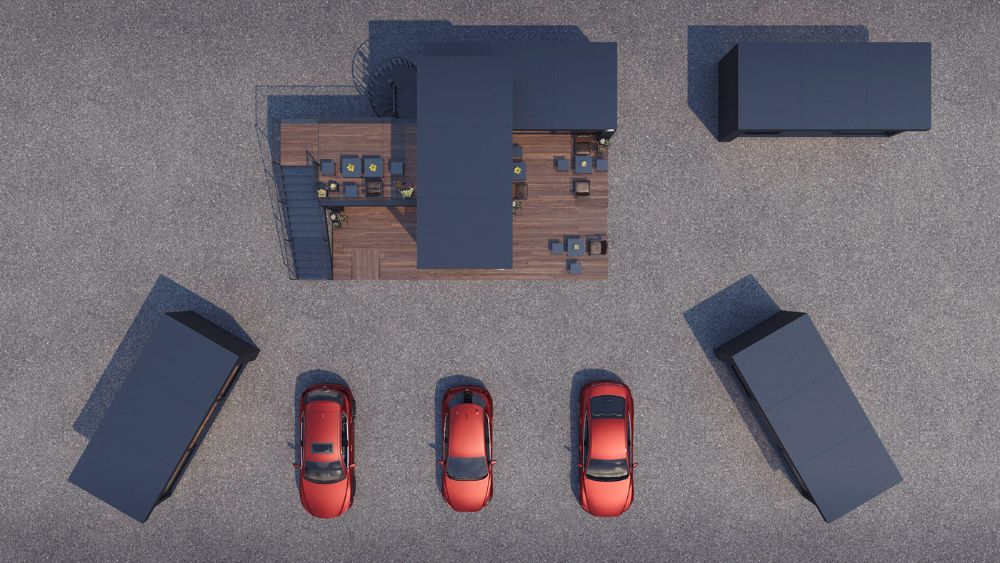
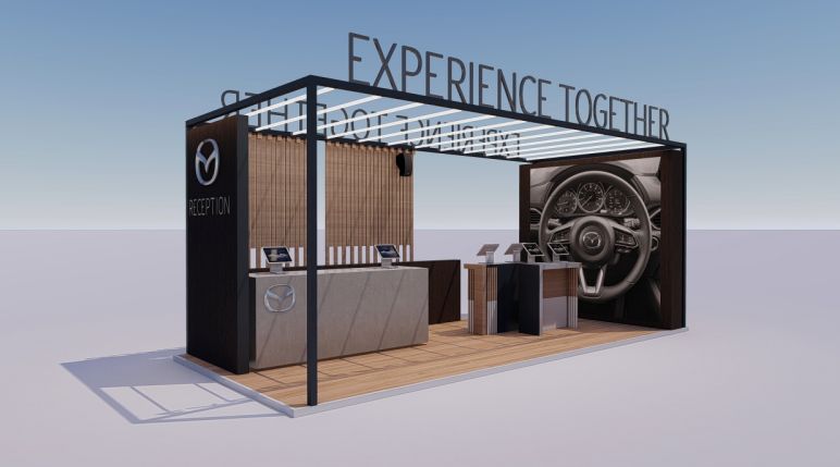
Brands wanted people to remember a message after a crowded event, not just walk past a stand.
Physical, playful interactions: people touch, choose and take something home, so the brand story stays with them.
A platform connecting designers and FMCG companies to solve sustainability challenges through co-creation. Runner-up at the MIT Business Plan Competition 2011, backed by Revo Capital and Hüsnü Özyeğin.
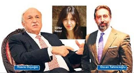
Built from zero: I led product strategy, launched the web app, defined the brand and grew a community of 1,100+ designers.
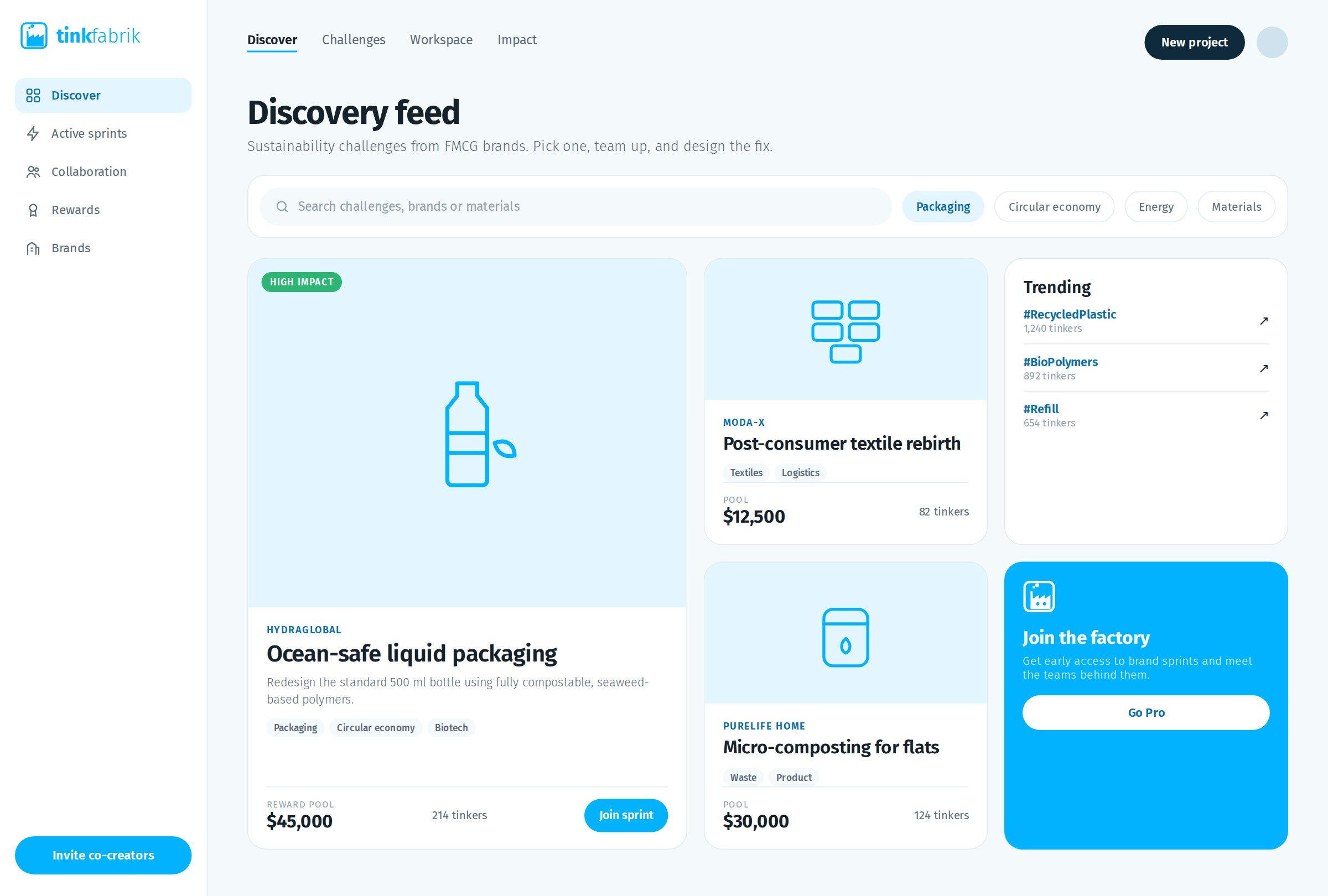
I managed in-house teams across UX, engineering, industrial design and QA, and built relationships with investors and brand partners.
Designers had ideas for sustainability, and FMCG brands had the problems, but there was no way to bring them together.
A co-creation platform where brands post real challenges and a community of 1,100+ designers answers them.